Did you do your application's UI / UX revamp all wrong?

Steve Krug wrote a book titled ‘Don’t Make Me Think’ which went on to become a bestseller as it presented a very common-sense approach to web usability. This book continues to be relevant even today as it highlighted the point that UI and UX are very critical components of success and that a poor job here will cause you to lose customers.
While at one point in time, the UX focus was for a certain segment, such as eCommerce, today every business has to have that same focus since we are getting increasingly digitized. Backend activities such as compliance, operational workflows, etc. which did not receive much UI and UX focus, are now getting the same as increasingly organizations are realizing that if they want customers and employees to use their applications then they have to be user-friendly, at the least.
Recently, one of our clients, who is a leading provider of enterprise solutions to life sciences companies, reached out to us to redesign the UI and UX for an enterprise product. This product was directed towards life sciences companies and was designed to help them track expenses incurred for healthcare and research events and report these to the US government.
In our experience, we have seen that many times, a UI and UX redesign is done with a cosmetic approach…change the color and font, shift a few buttons or just add a few buttons and voila! you have a brand new UI and UX. However, there is no tangible benefit of this approach. Having taken a look at the client’s product we decided that we had to take a very scientific and organized approach to achieve the UI and UX overhaul that the client and, we ourselves, were expecting.
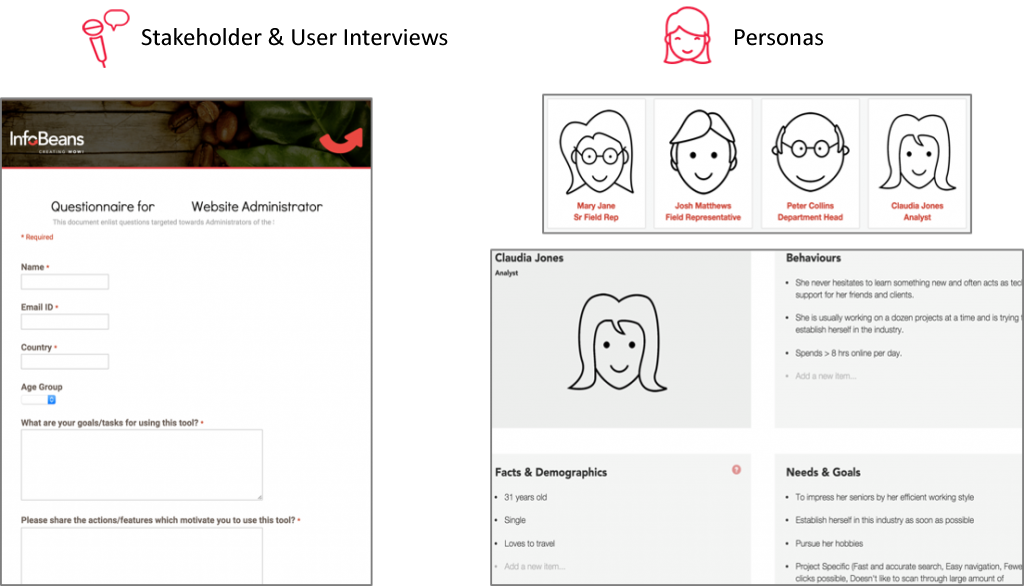
Interviews and Persona Definitions
In order to design a great UX, we first had to identify who was going to use the product. We created a thorough questionnaire for the users to identify factors like what their goals and motivations were behind using the tool, what encouraged the users to use the tool, which features prevented them from using the tool etc. On the basis of the answers, we created the user ‘Personas’ and covered the basic facts such as age and demographics, identified their behavior such as how long the user is online, what they usually work on etc. and identified their needs and goals.
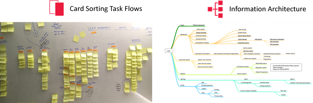
Task Flows
Once we had created the different user personas, we went on to identify their task flows. This covered what is the overall existing process, where does the existing application come into the picture and what were the tasks that the users expected to complete using the application. We utilized the card sorting method to iterate this step and comprehensively covered all the task areas, right from the login, search activities, reports, user management, etc.
Once the basic task flows were created, we went on to design an information architecture. Based on the user information, we made sure that we create a priority matrix to ensure that the most important features are taken into consideration first and the features not really viable to primary workflow are taken away or removed from the key flow. For example, users, for the most part, used only a few fields to perform Search from the Dashboard. And only in some cases, they needed other fields. So we divided the search feature into Quick Search and Advanced Search. Quick Search was added to the Dashboard with a link to Advanced Filters if the need be. We made sure that the Information Architecture was comprehensive and detailed enough to cover all the relevant touchpoints. We ensured that for each assigned work item (users call it ‘activity’ in their day to day communication) there was a detailed thread listing out all the tasks that should be optimally linked to that activity.
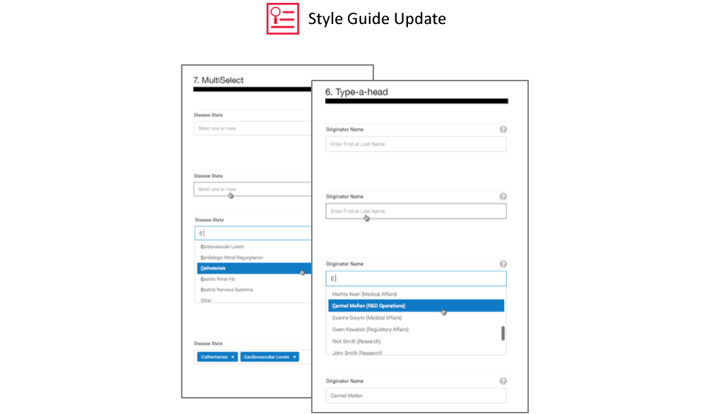
Style Guide
Now, we firmly believe that for consistency in UI and UX, it is imperative to have a style guide in place. A style guide essentially is a comprehensive document that iterates all the elements of a particular project for visual consistency, the context behind design decisions, code standardizations, placement of calls to action buttons, etc. are all detailed out in the style guide. Once we had our Information Architecture in place, we went on to update the style guide to take our project to its next step – the actual drawing board.
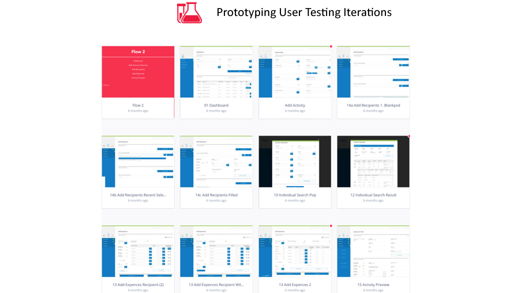
Prototyping, User Testing, Iterations
With the style guide and all crucial and relevant information in place, we went on to create UI prototypes that focused on a simpler and clutter-free interface and easy navigation. Intensive UI testing of this prototype followed. During this stage, along with conforming to the regular process of manually testing the UI, we also ensured that we had a set of the actual users using the tool to test the prototype. We made the relevant iterations based on these user interactions to develop a final product that featured highly on the usability and user experience matrix.
In today’s fast-paced world, the consumer really does not want to invest his/her time in figuring out how an application works. According to them, the user interface should be simple and easy to navigate and the User Experience should be easy, engaging and intuitive. You can be rest assured that today if a potential customer has to search for a particular thing on your application or website, it will only be a matter of seconds before he/she leaves your site.
Instead of looking at UI and UX as a cosmetic exercise that focuses only on beautification, adopting a methodical and scientific approach and actually improving usability results in great UI and UX design…one which keeps the actual users happy, engaged and productive on the tool.

Related content
Web3 and Blockchain
Tailored Web3 and blockchain solutions to help companies meet business objectives with scalability and insights.
Data Engineering
Empower your business with data-driven decision-making through our insightful data engineering solutions.
Cloud
We ensure secure migration of your data to a more efficient environment – Public, Private or Hybrid Cloud


Stay up to date with InfoBeans
Insights from our team of experts who deliver digital software day in and day out.
![]() Thank you for signing up!
Thank you for signing up!
![]() Thanks a lot for your interest. You are already a subscriber. You will receive your first newsletter soon.
Thanks a lot for your interest. You are already a subscriber. You will receive your first newsletter soon.